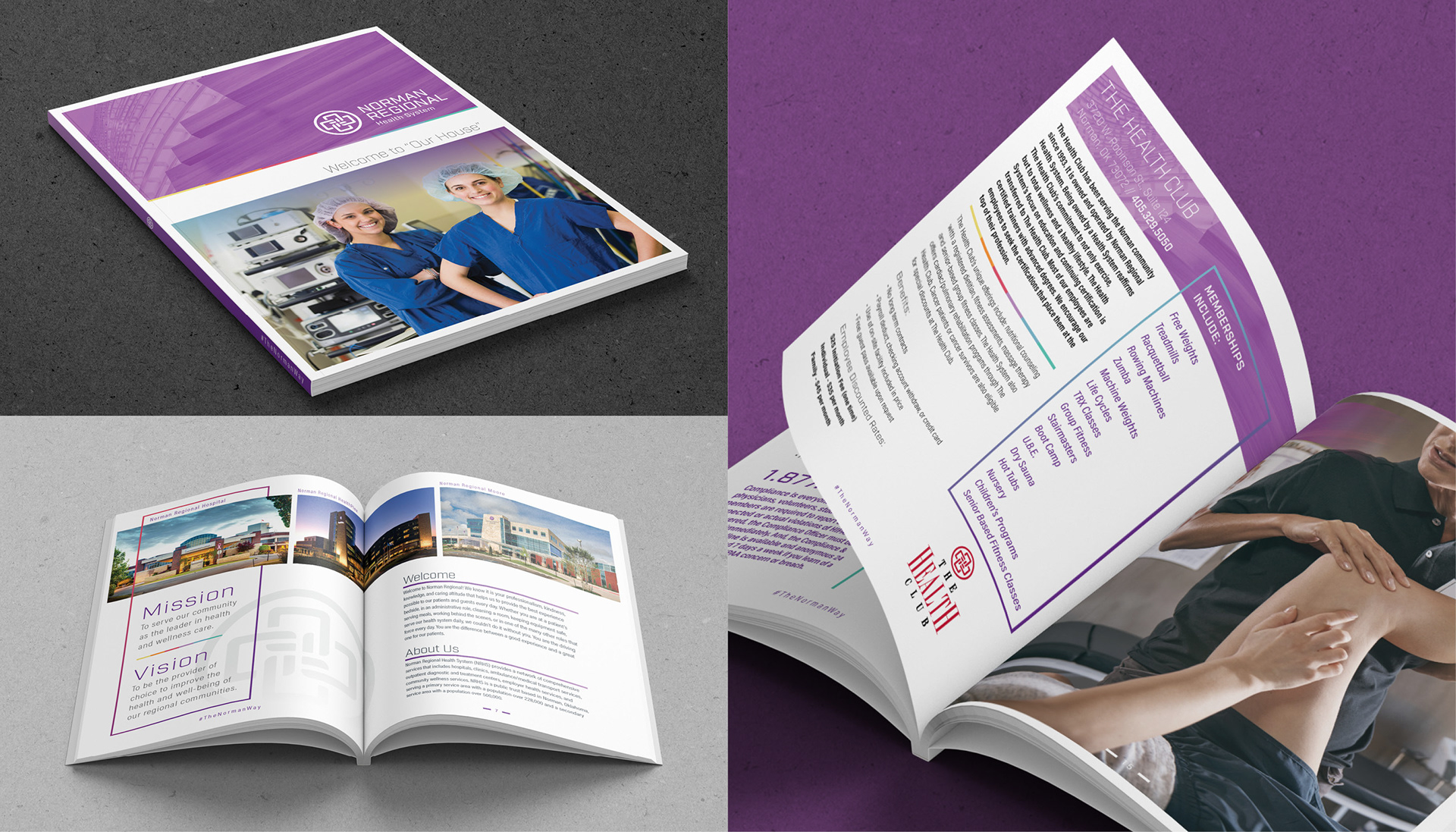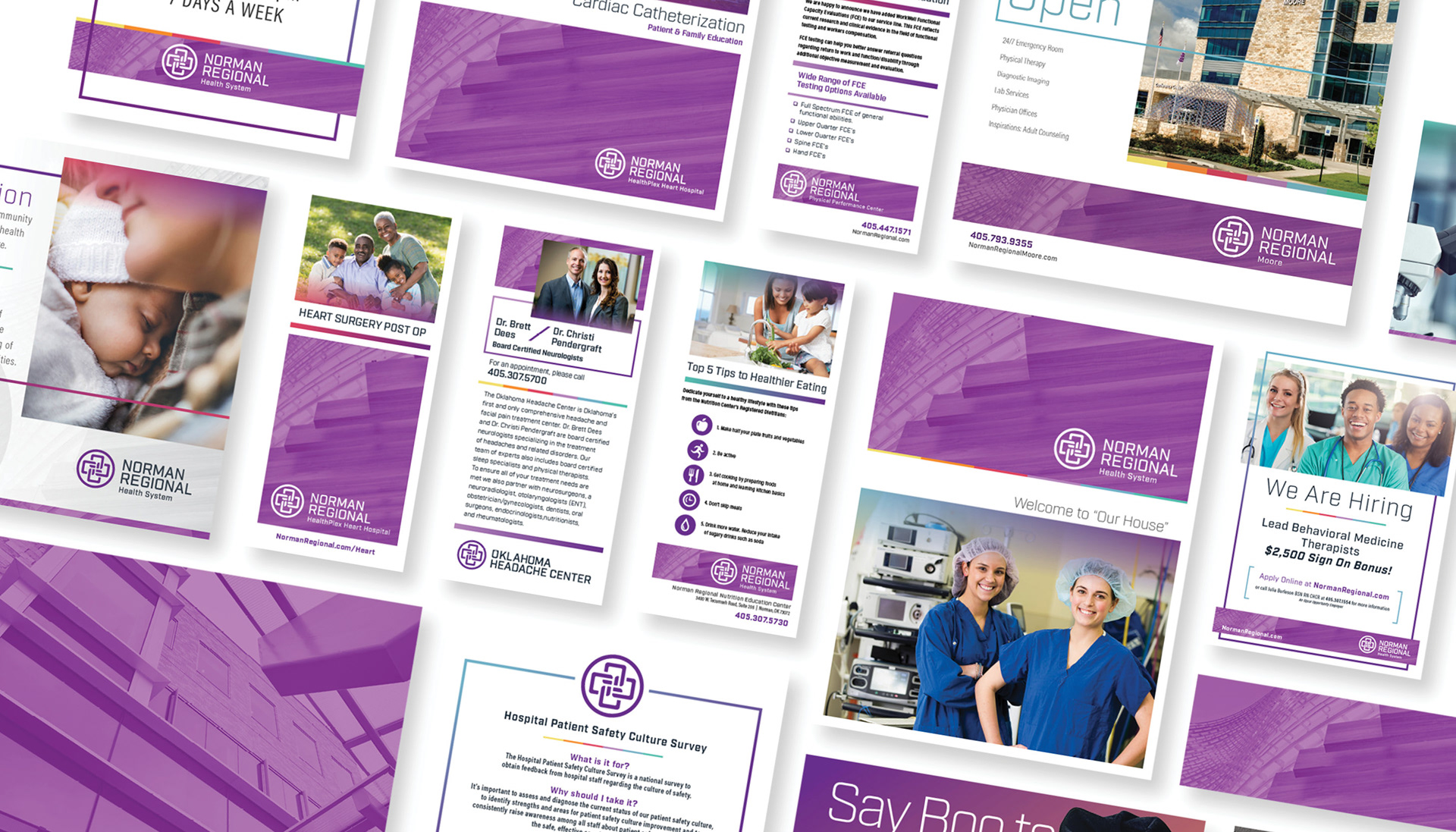
Norman Regional Health System Branding
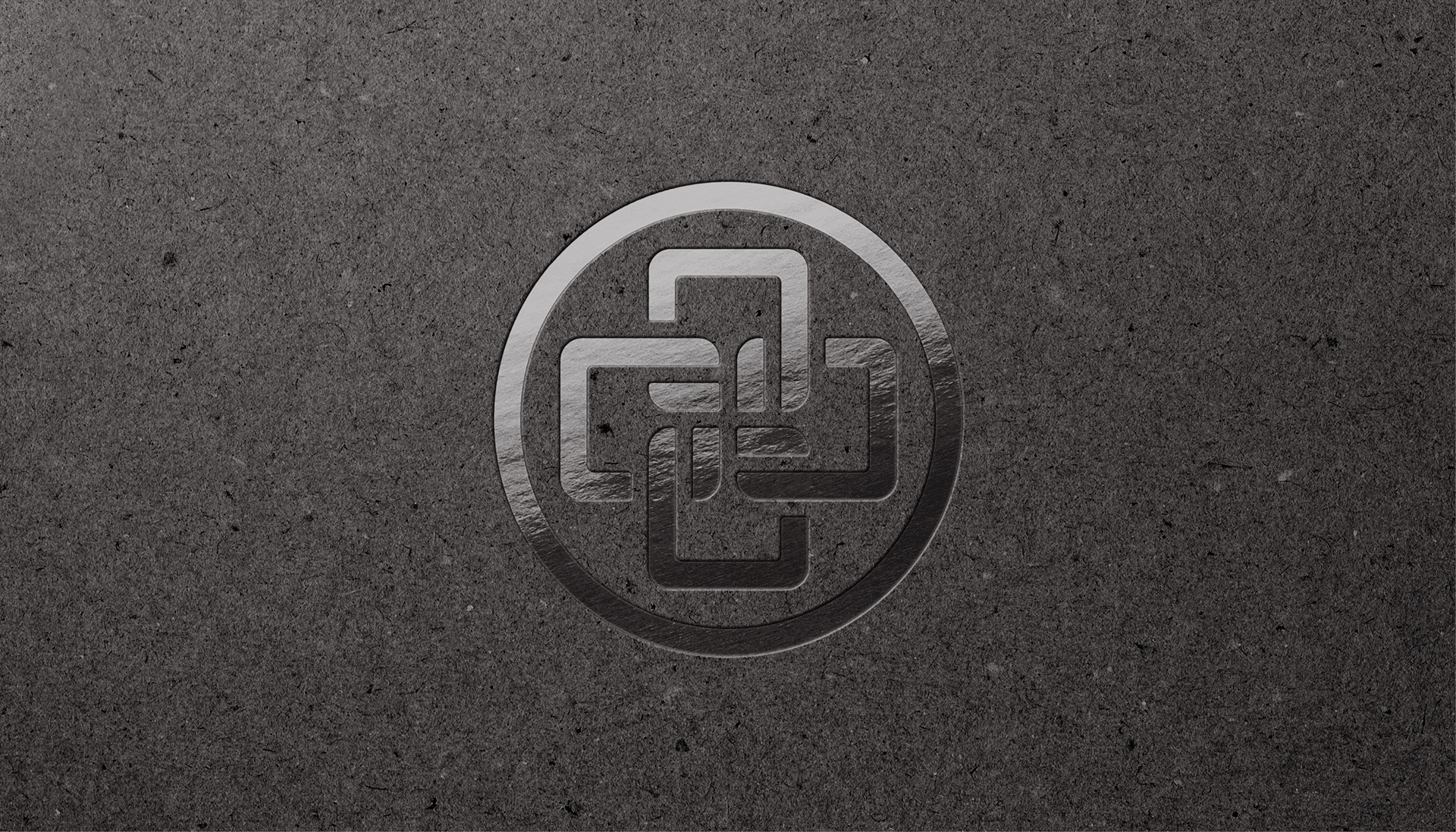
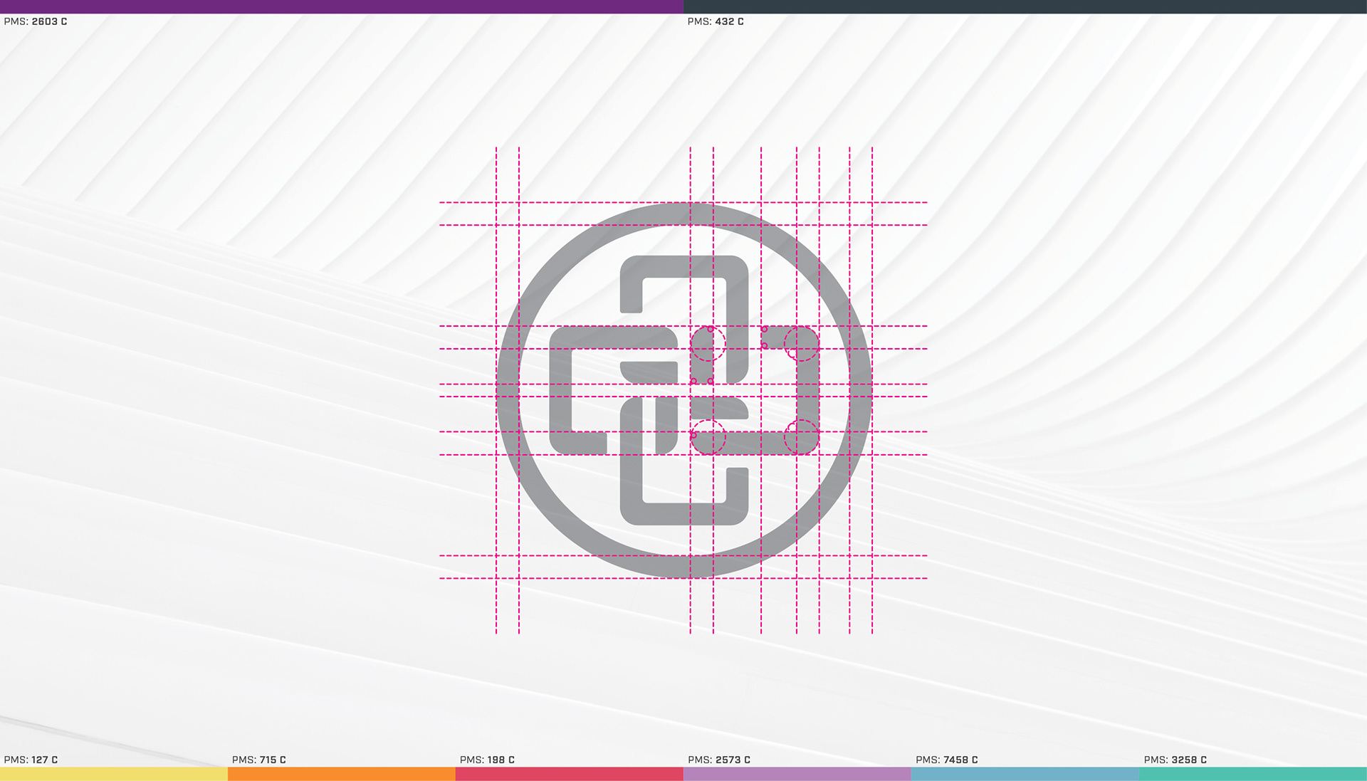
The geometric design of the Norman Regional Health System button is what we have called for the past 30 years, the connections or “links” between physicians, staff, patients and the communities we serve. We are linked together and dependent upon one another in improving the quality of life for our regional community.
The current mark is well known in our market, but required an update in order to keep the brand moving forward. The links have also been thoroughly massaged and softened to reflect the welcoming and cohesive nature of the health system.
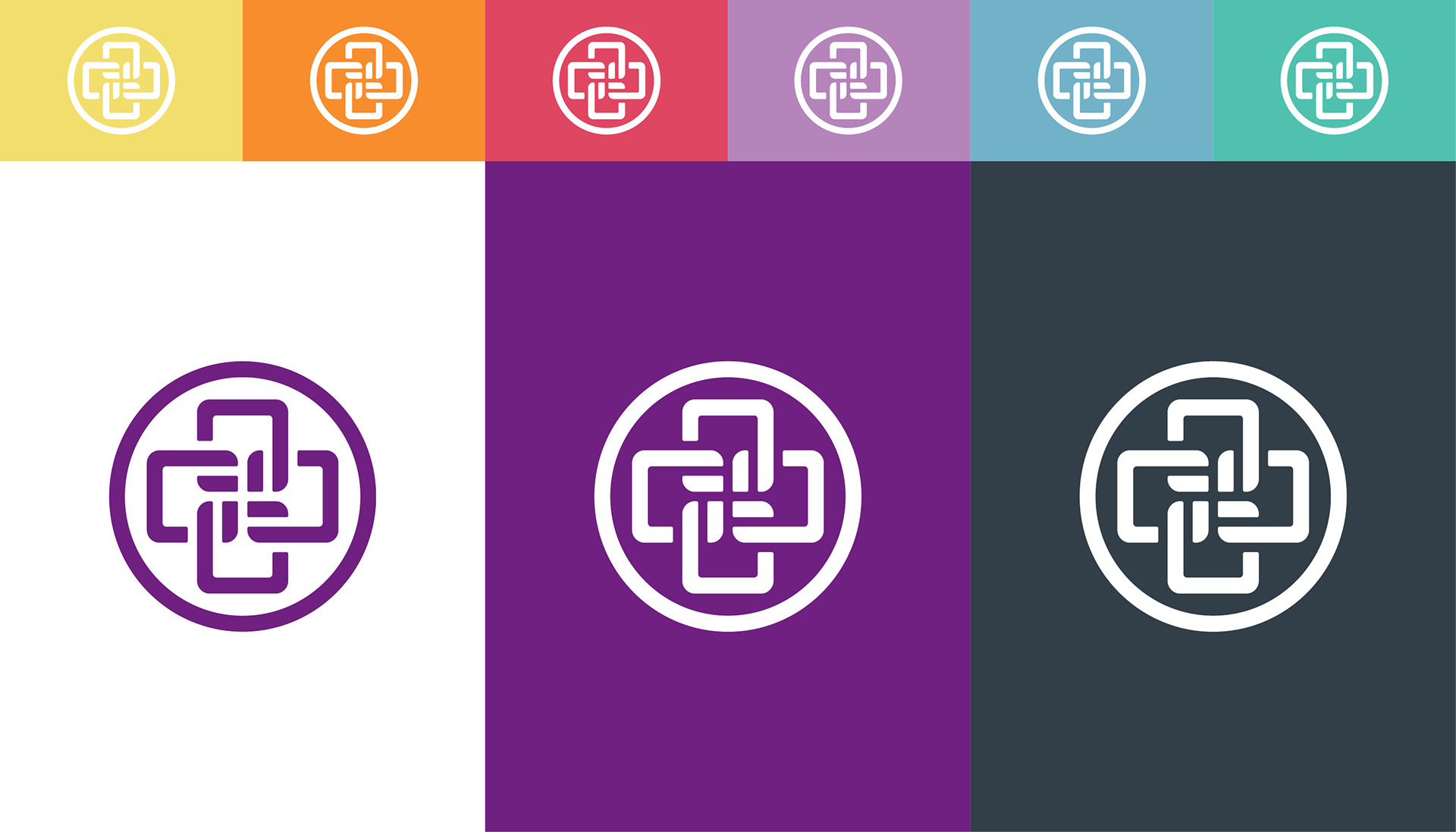
Through careful selection, we have chosen the best color option for each of the Norman Regional's core values.
Integrity, Communication, Attitude, Results and Engagement
Each color was chosen for the way it can help to communicate a particular mood, emotion or reaction.